Individual Commissions
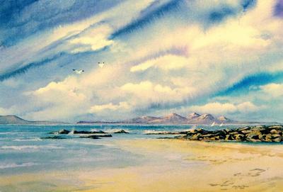
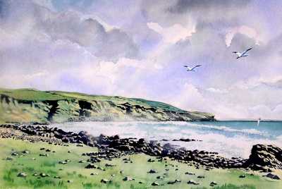
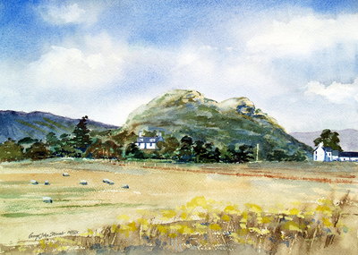
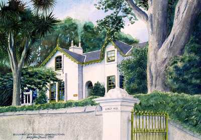
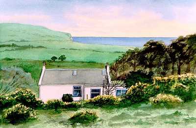
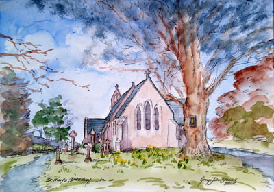
Commissioned work is often of limited interest to those outside a small circle. They are usually requested to revive fond memories of pets, houses, places and people - and in that order of popularity. Most of my animal paintings come under the title of Pet Portraits; and houses large and small are a favourite.
I sometimes wonder if portraiture is a dying artform. It used to command the highest prices - probably still does in certain circles - but it seems most are content with photographs. Somewhere, my family have a portrait of our paternal grandfather and great aunt as children, which was a photograph overpainted in oils; a practice relatively popular in the early twentieth century. Maybe this hybrid was portrait painting attempting to capture the market back from the photographer. All I can say is that if asked to produce a portrait today, it is without exception a photographic one.
As this sort of work needs to meet with certain detailed criteria to pass muster with the client, it places of necessity, limits to creative expression. Only artists widely recognised for their particular style can follow their Muse - although strictly speaking there is no Muse for painting. The jobbing artist must produce something that looks like its subject. At least that is my experience.
So here is a gallery of small selection from my favourite commissions ... in no particular order.
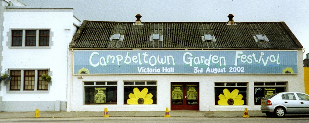
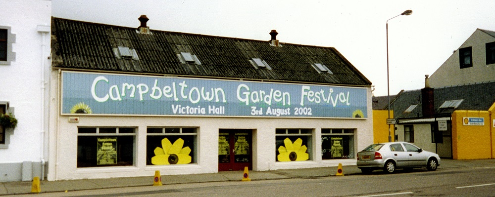
Campbeltown Garden Festival 2002
This unusual commission came my way through a friend who apparently had to doubt about my ability to pull it off. Most likely I was deemed less expensive than a banner and it was to be painted over as soon as the building - the old Campbeltown Motor Company showroom (originally a ropeworks) - was sold. It was fun being up a ladder painting this large sign with the wind whipping in from Campbeltown Loch, although maybe that is only in retrospect.
Kintyre Logo and Signage
I have a deep and abiding affection for Campbeltown and Kintyre, having known it from childhood, eventually coming to live in Kintyre in the late 1980′s until 2009, when we moved to Kilmartin. During our time there with The Oystercatcher Gallery, I was associated with the KINTYRE MARKETING GROUP (now integrated within Visit Scotland, I believe).
I was asked by KMG to produce a ‘logo’ for Kintyre to be used on brochures, road signage, etc to give Kintyre a ‘brand identity’. The brief was to incorporate a number of elements:
That original design was sketched out in a few minutes on the back of an old piece of mountboard (I was involved in a lot of picture framing then). The idea was to incorporate the Historical (the prow of Magnus Bareleg’s Viking longship – representing Tarbert and North Kintyre); the sea (Kintyre is ‘almost an island’ and fishing has played a major part for Campbeltown, Carradale and Tarbert particularly); and wildlife (in the form of an Arctic Tern forming the Y in KINTYRE).
One of the completed ‘Location Boards’ situated at strategic points from Southend in Kintyre to Inveraray. The one below is at Ronachan viewpoint.
The incorporation of a bird was an important part of the design because all the regional Tourism Boards were having new logos created at the time. However my choice of the Arctic Tern to show the predominantly maritime nature of Kintyre’s birdlife was over-ruled by the Steering Committee (despite most other coastal regions using a seabird motif), who felt that Arctic Terns were too esoteric for most visitors to Kintyre, preferring a Golden Eagle instead. This was to capitalise on the big fuss being made in the media over Scottish Power’s siting of a new windfarm near Carradale at the nesting site of a pair of these magnificent birds. (In the end the eagles – a protected species - rather took to the wind turbines, treating them as unusually branched trees, but early on there was much speculation about sliced and diced Eagle on the menu at local restaurants. I think that the turbines continue to be shut down during the nesting season. Latest news - Summer 2013 - is that a number of 'protected species' have been injured or killed by rotating turbine blades. Where will it go now?)
This whole episode was an interesting exercise in the compromises which must be made when art meets commerce, and invaluable experience in dealing with bureaucracy. I continue to hold the view that the Arctic Tern of the original would have made for a stronger, punchier design, but at the end of the day I doubt if anyone was much bothered one way or the other… or at all. The client has the final say in these things.
In late 2014, I was approached by BEAR Scotland the road management company to see if I still held the original artwork, so that they could use the ident on some new or replacement signs.
I had relinquished my original artwork to the initial contractors (Strathclyde Regional Council), but it turns out it had been lost or destroyed.
I was then asked to recreate the ident, and took the opportunity to tidy up one or two details intended for the original but never applied.
... but I still prefer the Arctic Tern.
I was asked by KMG to produce a ‘logo’ for Kintyre to be used on brochures, road signage, etc to give Kintyre a ‘brand identity’. The brief was to incorporate a number of elements:
- North and South Kintyre. i.e. link Campbeltown and Tarbert.
- Kintyre’s long historic heritage
- Wildlife and Nature
That original design was sketched out in a few minutes on the back of an old piece of mountboard (I was involved in a lot of picture framing then). The idea was to incorporate the Historical (the prow of Magnus Bareleg’s Viking longship – representing Tarbert and North Kintyre); the sea (Kintyre is ‘almost an island’ and fishing has played a major part for Campbeltown, Carradale and Tarbert particularly); and wildlife (in the form of an Arctic Tern forming the Y in KINTYRE).
One of the completed ‘Location Boards’ situated at strategic points from Southend in Kintyre to Inveraray. The one below is at Ronachan viewpoint.
The incorporation of a bird was an important part of the design because all the regional Tourism Boards were having new logos created at the time. However my choice of the Arctic Tern to show the predominantly maritime nature of Kintyre’s birdlife was over-ruled by the Steering Committee (despite most other coastal regions using a seabird motif), who felt that Arctic Terns were too esoteric for most visitors to Kintyre, preferring a Golden Eagle instead. This was to capitalise on the big fuss being made in the media over Scottish Power’s siting of a new windfarm near Carradale at the nesting site of a pair of these magnificent birds. (In the end the eagles – a protected species - rather took to the wind turbines, treating them as unusually branched trees, but early on there was much speculation about sliced and diced Eagle on the menu at local restaurants. I think that the turbines continue to be shut down during the nesting season. Latest news - Summer 2013 - is that a number of 'protected species' have been injured or killed by rotating turbine blades. Where will it go now?)
This whole episode was an interesting exercise in the compromises which must be made when art meets commerce, and invaluable experience in dealing with bureaucracy. I continue to hold the view that the Arctic Tern of the original would have made for a stronger, punchier design, but at the end of the day I doubt if anyone was much bothered one way or the other… or at all. The client has the final say in these things.
In late 2014, I was approached by BEAR Scotland the road management company to see if I still held the original artwork, so that they could use the ident on some new or replacement signs.
I had relinquished my original artwork to the initial contractors (Strathclyde Regional Council), but it turns out it had been lost or destroyed.
I was then asked to recreate the ident, and took the opportunity to tidy up one or two details intended for the original but never applied.
... but I still prefer the Arctic Tern.
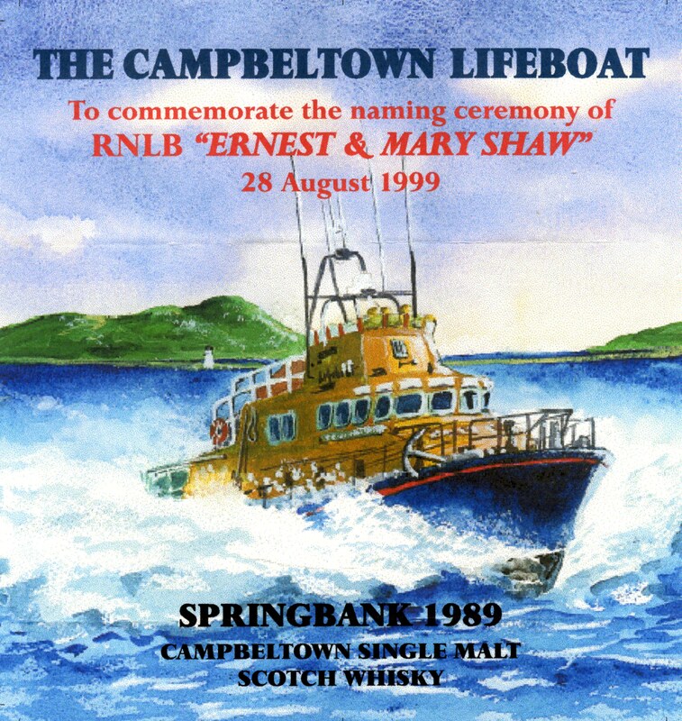
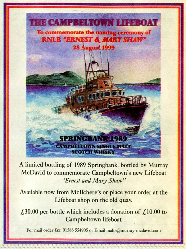
Springbank Whisky Label
LABEL DESIGN FOR LIMITED EDITION BOTTLING OF 1989 SPRINGBANK SINGLE MALT TO SUPPORT R.N.L.I.
In 1999, a special bottling of 1989 Springbank Single Malt was released to raise funds for the Royal National Lifeboat Institution; specifically the Campbeltown Branch and their lifeboat, the RNLB Ernest and Mary Shaw. 10% of the proceeds from the sale of each bottle would be donated, and I was approached by Murray McDavid to illustrate the lifeboat in Campbeltown Loch for the label.
